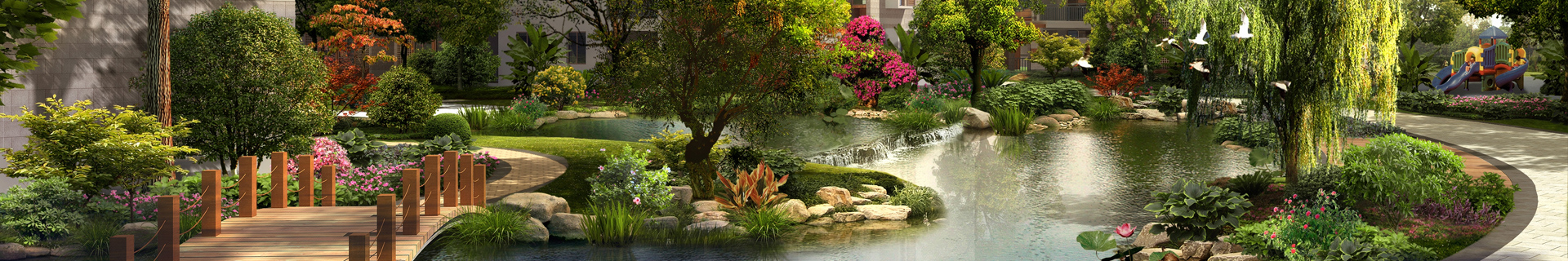
Color is one of the most important design elements in garden landscape design, which can be used to adjust the atmosphere and emotional expression of the whole garden. In landscape design, color application skills are very important. Harbin Landscape Design Company This article will introduce the skills of color application in landscape design to help designers better use color and create a more beautiful, comfortable and harmonious garden.
1、 Color classification
In garden landscape design, there are three kinds of colors commonly used, namely primary color, secondary color and intermediate color.
Primary color: Refers to three basic colors, namely red, yellow and blue, which cannot be mixed.
Secondary color: refers to the color mixed by two primary colors, including orange, purple and green.
Intermediate color: refers to the color mixed by two auxiliary colors, including yellow green, red purple, orange yellow, cyan, purple red and cyan.
2、 Basic Rules of Color Application
1. Comparison principle
In the landscape design, the color combination should follow the principle of sharp contrast, that is, there should be a clear distinction between the color style and emotional expression to highlight the characteristics and highlights of the landscape. Through the contrast of light and shade, temperature, brightness and chroma of contrast colors, you can create colorful, layered and rhythmic visual effects.
For example, in the garden landscape design, the combination of cold and warm colors can be used to increase the visual impact of the landscape through sharp contrast, making the whole space more dynamic and varied.

2. Color distribution balance principle
The principle of color distribution balance means that colors widely distributed in space should be moderately balanced. People have different tastes and hobbies for color in different occasions, different times and seasons. Scientific balance is needed in the design to make the whole space present a harmonious and harmonious atmosphere.
For example, in large parks and scenic spots, corresponding warm colors or cold colors should be added according to the site characteristics, time and season, climate conditions and other factors, so as to balance the colors of plants and landscapes, form various shades, luminosity and contrast, and form a colorful landscape.
3. Application principle of neutral color
Neutral color is used to coordinate and balance colors, such as white, black, gray, etc. If properly used in color combination, it can help to adjust the contrast and coordination between colors to form a comfortable, harmonious and neat effect.
For example, in plant color design, different neutral colors can be used to render and adjust the contrast and brightness of colors to show different atmosphere and style.
3、 Common color matching methods
In landscape design, there are many kinds of color matching, which will present different effects and atmosphere according to different matching methods. Here are some common color matching methods:
1. Monochrome matching
Monochromatic collocation means that in the whole hue, the basic color and the derived color are the same tone, and the lightness and saturation of the color change. The color atmosphere created by the monochrome combination is relatively simple, but also more pure and harmonious.
For example, in a green garden, a monochrome green tone is used to express a natural, harmonious and comfortable atmosphere.
2. Contrast color matching
Contrast color matching refers to the use of two colors in the hue that are opposite to the basic color and the derived color, such as red and green, blue and orange. Because of the obvious contrast, it is easy to produce strong visual impact, and is often used to create a vivid and bright color atmosphere.
For example, in places that need to show vitality and personality, such as amusement places and leisure places, the use of yellow and purple contrast colors can create a jumping and vibrant atmosphere.
3. Color matching
Analogical color matching refers to the use of two similar color systems in color matching, such as green and yellow green, which can make the whole tone appear harmonious, peaceful and comfortable. If appropriate neutral colors are added, the color hierarchy can be more rich.
For example, the use of yellow green and light green analogy colors in the park scenic area gives people a warm, leisurely and comfortable feeling.
In landscape design, color is a very expressive element, and its application skills directly affect the appearance and atmosphere of the whole garden. We must reasonably arrange, match and adjust the colors according to the characteristics, functionality and viewing effect of the place to design a garden landscape that meets people's visual and emotional needs.